Handleiding
Je bekijkt pagina 32 van 41
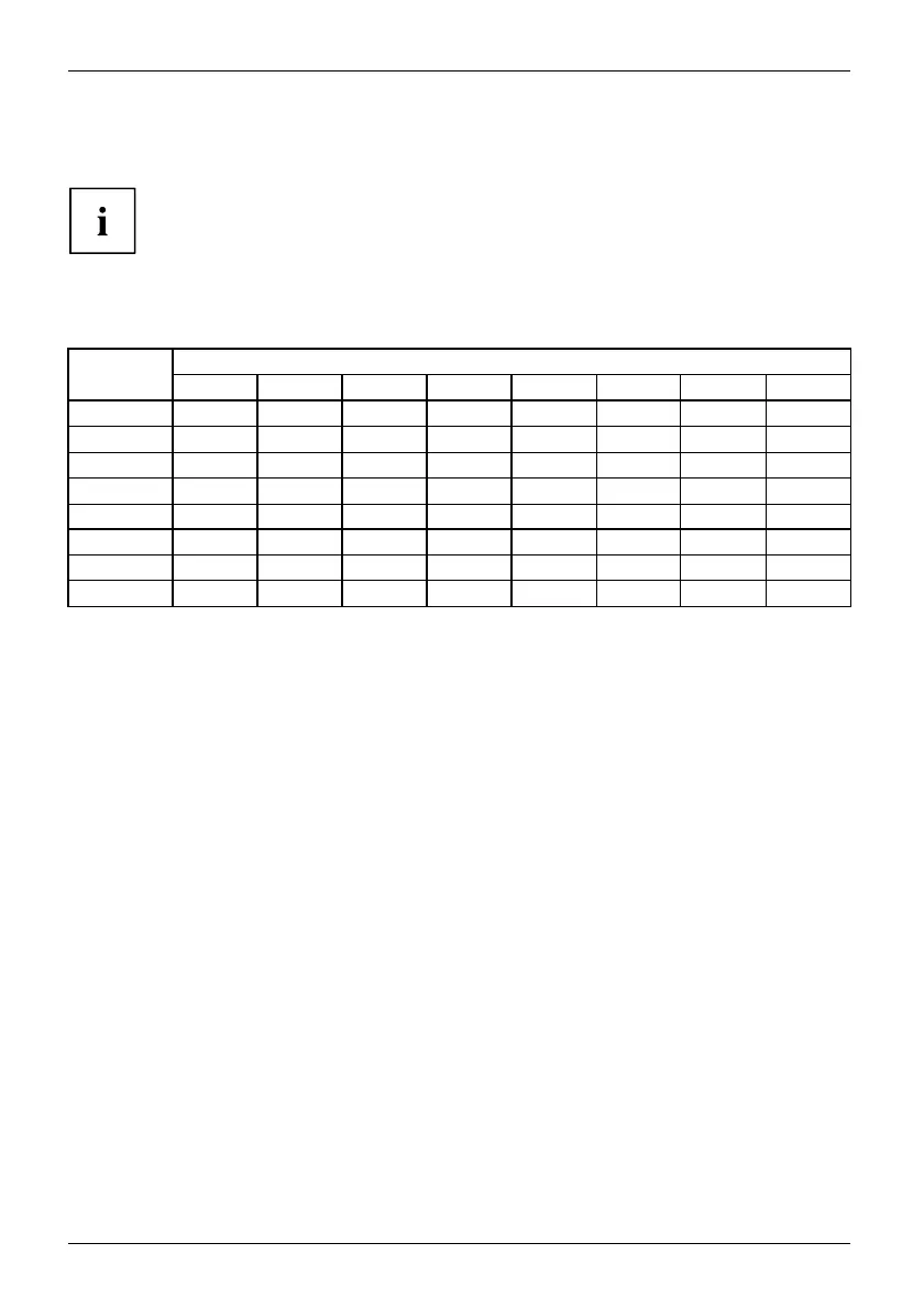
Notes on ergonomic colour adjustmen
t
Notes on ergonomic colour adju
stment
If you select colours for the monitor in your application programmes,
take note of the i nformation below.
The primary colours blue and red on a dark background do not produce the minimum
required contrast of 3:1 and are therefore not suitable for continuous text and data entry.
When using several colours for characters and background a nd giving the primary colours full
modulation, you can obtain v ery suitable colour combinations (see the following table):
Characters
Background
black white purple blue
cyan green
yellow red
black
++
-
+++
-
white
+++
---
+
purple
++
-----
blue
-
+
-
+
-
+
-
cyan
+
--
+
---
green
+
--
+
---
yellow
+
-
++
--
+
red
-
+
----
+
+ Colour combination very suitable
- Colour combination not suitable because colour hue s are too close together, thin characters
are not identifiable o r rigorous focusing is demanded of the human eye.
28 Fujitsu Technology Solutions
Bekijk gratis de handleiding van Fujitsu P27T-6 IPS, stel vragen en lees de antwoorden op veelvoorkomende problemen, of gebruik onze assistent om sneller informatie in de handleiding te vinden of uitleg te krijgen over specifieke functies.
Productinformatie
| Merk | Fujitsu |
| Model | P27T-6 IPS |
| Categorie | Monitor |
| Taal | Nederlands |
| Grootte | 2793 MB |
Caratteristiche Prodotto
| Kleur van het product | Wit |
| LED-indicatoren | Stroom |
| Beeldscherm | LCD |
| Beeldschermdiagonaal | 27 " |
| Resolutie | 2560 x 1440 Pixels |


